
What Font Do You Use When Writing a Book?
Choosing the right font for your book can make a big difference in readability and aesthetics. Serif fonts like Garamond and Baskerville are popular choices for their classic and elegant appearance. These fonts are often used in printed books because they guide the reader’s eye along the text, making it easier to read for long periods.
Are Different Fonts Used for Different Genres?
Yes, the type of book you’re writing can influence your font choice. For instance, a thriller might benefit from a sharp, clean font like Helvetica, while a historical drama could be enhanced by a more traditional typeface such as Times New Roman. Creative books, like those that mix in stories within non-fiction, often use a variety of fonts to separate different sections or highlight special messages.
What About Ebooks?
The font for an ebook needs to be versatile to ensure it displays well on various devices. It’s crucial to choose a font that maintains readability, like Georgia or Arial, while also considering font size. A recommended font size for body text in ebooks is 12 points for comfortable reading, with larger sizes for chapter titles.
Understanding how to select the correct font is a key part of good book design. Your font choice contributes significantly to the overall experience of your readers.
Understanding Typeface Basics
The choice of typeface is as crucial as the story itself. A typeface, often confused with a font, is the design of lettering that includes variations in size, weight (bold, regular, or light), and style (italic, normal, or oblique). Each typeface can contain a number of fonts, representing different sizes and styles of that typeface design.
It is crucial to know what font are books written in because It helps in improving readability and setting the right tone for your content.
Typeface vs Font
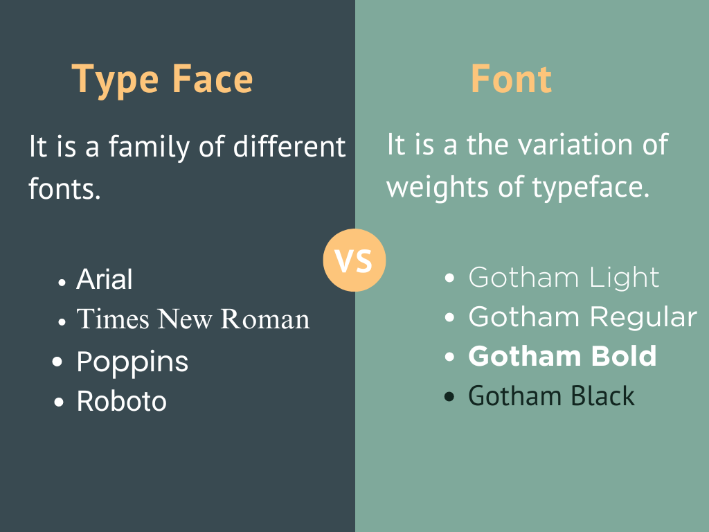
- A typeface is a family of related to book fonts, such as Times New Roman or Arial. Within each typeface, you’ll find different fonts.
- A font refers to a specific weight and style within a typeface. For example, Times New Roman Bold and Times New Roman Italic are different fonts but belong to the same typeface.
Tip: Serif typefaces like Baskerville are preferred for body text, while sans-serif typefaces like Arial are suitable for headings.
|
Criteria |
Typeface |
Font |
| Definition | A family of related fonts. | A specific weight and style within a typeface. |
| Components | Includes fonts like:Regular, Bold, and Bold Italic | Represents styles like:Regular, Bold, Bold Italic |
| Impact on Readability | Choice of typeface affects overall readability and presentation. | Choice of font affects the emphasis and style of text. |
| Usage Example | Times New Roman (Typeface) | Times New Roman Bold (Font) |
Font Family and Classification
Font families are groups of related typefaces sharing similar design characteristics. They can be classified into several categories:
- Serif: These fonts have small strokes at the ends of letters, enhancing readability. Common examples include Times New Roman and Garamond. They are great for long texts.
- Sans-Serif: These fonts lack small strokes, offering a clean and modern look. Examples include Arial and Helvetica. These are good for headings and digital formats.
- Display: These are decorative fonts used for specific purposes, such as covers or titles. They are not suitable for body text due to their intricate designs.
Choosing the right book fonts from the font family and classification affects how readers perceive your book. For instance, a combination of serif for body text and sans-serif for headings balances readability and aesthetics.
Understanding what is the most common font used in books will help you make informed choices for your book font, improving its overall presentation and reader experience.
Choosing the Right Font for Your Book
Selecting the right book fonts is crucial for setting the tone and ensuring a pleasant reading experience.
Factors like the genre, mood, readability, and font size all play important roles.
Genre and Mood Considerations
When choosing a book font, consider the genre and mood of your book. For instance, serif fonts like Times New Roman or Garamond work well for traditional novels, as they give a classic and professional look.
Learning what what font is used in books for different genres is crucial. If you’re writing a fantasy novel, you might opt for more decorative fonts to create a mystical feel. For non-fiction books, a clean and straightforward font such as Helvetica or Arial is typically preferred.
- Fantasy: Goudy Old Style
- Thriller: Baskerville
- Romance: Georgia
These fonts help convey the right atmosphere and keep readers engaged.
Calibri Vs. Garamond: What Is The Most Common Font Used In Books
|
Book Type |
Recommended Fonts |
Font Sizes |
| Fiction Books | Times New Roman, Garamond, Baskerville | 11-12 pt for body text |
| Children’s Books | Comic Sans, Century Gothic, Helvetica | 14-18 pt for body text |
| Non-Fiction Books | Arial, Calibri, Helvetica | 11-12 pt for body text |
| Poetry Books | Georgia, Palatino, Garamond | 12-14 pt for body text |
| Thriller Books | Garamond, Georgia, Times New Roman | 11-12 pt for body text |
| Romance Books | Baskerville, Garamond, Times New Roman | 11-12 pt for body text |
Readability and Legibility
Your font choice directly affects how easy it is for readers to follow your text. Serif fonts are often preferred for printed books because the small lines and strokes at the end of letters enhance readability by guiding the eye from one letter to the next. Some popular serif fonts include:
- Times New Roman
- Garamond
- Baskerville
Conversely, sans-serif fonts like Arial or Helvetica are often used for digital or young adult books because they are clean and straightforward.
Ensure the font contrasts well with the background, and avoid decorative fonts in body text as they can be hard to read.
Font Size and Weight
Font size and weight can drastically affect the length and appearance of your book. For most printed books, a font size between 10 and 12 points is common. Larger sizes, such as 14 to 18 points, are recommended for children’s books to facilitate easier reading.
| Font Size | Recommended Use |
| 10-12 pt | Novels and adult books |
| 14-18 pt | Children’s books |
Font weight is also important. Regular weight fonts are standard for most body text, but feel free to use bold or italic weights for headers and emphasis. Make sure to maintain a balanced look throughout your book.
By paying attention to genre, readability, size, and weight, you can choose a font that enriches your book and offers an enjoyable reading experience.
Serif vs Sans Serif
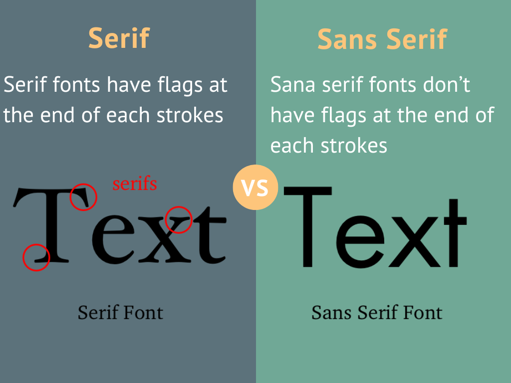
When writing a book, choosing the right font can greatly impact readability and the overall presentation of your work. Serif fonts are often preferred for print, but sans serif fonts have their own uses too.
| Advantages | Serif Fonts | Sans Serif Fonts |
| Enhanced Readability | Serifs guide the reader’s eyes along lines, making lengthy paragraphs easier to read. | Cleaner lines make text clear and simple. |
| Appearance | Creates a classic, formal, and elegant look. | Provides a clean, modern, and contemporary look. |
| Legibility | More legible at smaller sizes, useful for content-dense books. | Clear and readable on digital screens. |
| Best Uses | Ideal for body text in printed books, historical novels, and academic texts. | Ideal for section headings, chapter titles, and casual reads. |
| Reader Engagement | Detailed design adds a touch of tradition and formality. | Simple design is less intimidating, encouraging engagement. |
| Versatility | Works well in print, maintaining readability and elegance. | Adapts well to various screen resolutions and sizes, ideal for e-books. |
What Font Is Used In Books: Notable Fonts for Book Publishing:
Choosing the right font for your book is essential for readability and setting the appropriate tone. Here are some classic and contemporary fonts that are widely recommended for book publishing.
Classic and Timeless Selections
-
Garamond
- Garamond is a classic choice for many book publishers. Styled after the work of 16th-century engraver Claude Garamond, it is elegant and highly readable, making it a standard option in many applications, including Microsoft Word. Its timeless appeal ensures that it can fit a variety of book genres.
-
Baskerville
- Baskerville is another classic serif font that dates back to the 18th century. It is known for its crisp lines and high contrast between thick and thin strokes, which results in a clean, readable text. This makes it a popular choice for literary works and educational materials.
-
Bembo
- Bembo is favoured for long reads due to its excellent readability. This font, based on a typeface cut by Francesco Griffo in the late 15th century, offers a combination of warmth and professionalism that is perfect for novels and historical works.
Here is a quick comparison:
| Font | Origin | Use Cases |
| Garamond | 16th Century | General, Microsoft Word |
| Baskerville | 18th Century | Literary works, educational |
| Bembo | 15th Century | Novels, historical works |
Typography in Book Layout
Selecting the right typography for your book layout is crucial for readability and overall presentation. This section breaks down the vital aspects of choosing fonts for both chapter titles and body text.
Chapter Titles and Headings
Your chapter titles and headings need to stand out and attract attention. For this reason, it’s best to use bold and distinctive fonts. Fonts like Garamond or Baskerville are commonly chosen for their classic yet elegant appearance.
- Font Size: Typically, chapter titles range between 14-18 points.
- Font Style: Serif fonts often work well as they add a touch of formality.
- Hierarchy: Maintain clear hierarchies with primary headings larger than subheadings.
Using different styles, such as italics or small caps, can also help create a visual distinction between various sections of your chapters, ensuring they stand out.
Body Text and Paragraphs
For the main body text, readability is key. You want a font that is easy on the eyes and maintains a clean, professional look. Times New Roman and Garamond are popular choices due to their legibility and common usage in published works.
- Font Size: A 12-point size is standard for body text to ensure it is readable.
- Line Spacing: Provide 1.15 or 1.5 spacing between lines.
- Indentation: Typically, the first line of each paragraph is indented.
Maintaining consistency in your body text helps create a pleasant reading experience. Avoid overly decorative fonts that might distract the reader or make large blocks of text difficult to read.
By following these guidelines, you can create an attractive, readable book layout that appeals to your audience.
Special Considerations for Digital Publishing
When choosing fonts for digital publishing, you need to consider both readability on screens and legal aspects like font licensing. These factors ensure your eBook is both user-friendly and compliant with copyright laws.
Ebooks and Screen Readability
Fonts for eBooks should enhance readability on various screen sizes and resolutions. Digital screens can vary greatly, from high-resolution tablets to older e-readers with lower resolution.
- Georgia: Designed for digital text, Georgia has a formal yet charming look and performs well even on lower-resolution screens.
- Arial: This sans-serif font is clear and easy to read on screens, making it a reliable choice for eBooks.
- Verdana: Crafted specifically for digital use, Verdana offers large x-heights and wide letter spacing, providing excellent readability.
List of Attributes for Good Digital Fonts:
- Clear character shapes: Easy to distinguish.
- Large x-height: Letters appear bigger and clearer.
- Generous spacing: Enhances readability and reduces eye strain.
Font Licensing and Usage Rights
When selecting fonts, it’s crucial to understand the licensing terms to avoid legal issues. Many popular fonts come with specific usage rights that must be respected.
- Open-source Fonts: Fonts from sites like Google Fonts are free to use and often have flexible licenses.
- Commercial Fonts: These may require a license fee or have restrictions on how they can be used.
- Embedded Fonts: Ensure the font license allows embedding so it displays correctly on all devices.
Key Points to Consider:
- Check the license: Always verify the font’s license terms.
- Understand embedding rights: Ensure your chosen font can be embedded in eBooks.
- Commercial vs Free: Determine whether a paid or free option suits your needs and budget.
Choosing the right font and verifying licensing can significantly impact the readability and legality of your digital publication.
Practical Tips for Font Selection
Choosing the right font for your book involves considering both practical and aesthetic aspects. It’s important to find budget-friendly resources and utilize effective font selection tools.
Budget-Friendly Font Resources
Finding the right font on a tight budget can be challenging. Fortunately, there are several resources available:
- Google Fonts: A comprehensive collection of free and open-source fonts. It’s ideal for both print and digital formats.
- Dafont: Offers a wide variety of fonts, including many free options. Great for both unique and classic styles.
- Canva: While known for design purposes, Canva provides free fonts that can be used in book designs.
- Font Squirrel: Focuses on quality, freely available fonts suitable for personal and commercial use.
These resources provide a wide range of fonts without breaking the bank, allowing you to maintain quality and consistency in your book’s design.
Font Selection Tools
When it comes to selecting the perfect book font, several tools can simplify the process:
- MyFonts: This tool not only helps you browse an extensive library of fonts but also offers a search feature using imagery and keywords.
- Adobe Fonts: Formerly known as Typekit, provides a seamless integration of fonts across Adobe software, perfect for creating and editing book designs.
- WhatFont: A browser extension that identifies fonts on any website, helping you discover new fonts and understand how they look in different contexts.
- Font Pair: Assists in finding the best font combinations, ensuring that your headings and body text complement each other well.
These tools help streamline the process of choosing fonts, ensuring that they are visually appealing and appropriate for your book’s genre and content.
Wrapping up:
Choosing the right font when writing a book is a critical decision that can greatly impact the readability and overall appeal of your work. By considering factors such as genre, audience, and personal preference, authors can make informed choices that enhance the reader experience. The expert recommendations provided in this article offer valuable insights into selecting fonts that best suit different types of books. Remember to also pay attention to font size and spacing to ensure optimal legibility. Take the time to experiment with different fonts before making a final decision, and always prioritize clarity and accessibility for your readers. Make sure to choose wisely, as the font you select will play a significant role in shaping how your book is perceived by its audience.